
The recent edition of IIGF had a confident air of fashion about it – from clever execution of impending trends to pulling off spectacular displays of it. One could easily sense the conscious effort that had been applied by exporters to create individual identities of their stalls, standing out in every aspect of visual appeal backed by well-conceptualized collections and an aura of optimism. Taking genuine insights from previous years’ shortcomings, the exporters put forth an improved understanding of fashion as well, daring to bring experimental designs and demographic specific collection to the stands. A transition well perceived by visitors, bringing in genuine enquiries…
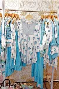
What particularly took the fair a notch higher were a series of engaging displays – clean and aesthetically attractive. Adding onto the overall quality of the fair, the clever placement of merchandise took over the casual, regular displays that have been the fair’s hallmark for many years, giving way to comprehensible colour, print and embroidery stories. The displays revolved around colour-coordinated rows of merchandise – from ombre tops placed in a palette gradation to well defined print concepts. Sopra Overseas’ exhibit, built on the same concept, further directed visitors to different sections of abstract geometry and botanicals.
Attention to detail was also a welcome change – installation art aligning with the season’s themes, technique swatches pinned to the walls and creating a favourable ambience, all accounted for a pleasant aura in and around the event.
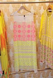
While the bright colours reflected the vibrant nature of the fair, the all-white displays in every second stall spelled out a subtle summer like no other colour. Interestingly, many were not using it like an all time classic; Mariko went a step ahead and used “white” as a selling strategy, working the colour onto different styles. While making a collection around selected colours might restrict its viability amongst certain buyers, a range of styles with embroideries and other value-added elements certainly show well on neutrals, an advantage that was adopted by majority of exporters in the fair. So, while “white” was the most preferred colour for displays this year, it also definitely doubled up as a summer staple for the coming season. The racks at NCCR Exports were inundated with every style crafted in the colour white, with bright colours popping out only through intricate value additions over an all white fabric base.
The latest collections unfolded trends which were comparatively easy to grasp. India’s signature schiffli embroidery, geometric prints – tribal and abstract, neon accents and multi-coloured embroideries could be identified as the most prominent trends after having browsed through a few stalls. Playing safe in some cases, exporters like Design Concept were also found smartly blending two or more trends together in a single garment, with the most fascinating example being a white top with a tribal embroidery pattern in neon coloured threads.
Proudly tagged as a patent of Indian exporters, schiffli work is yet again a popular choice with buyers having a serious penchant for it, but this time it was mostly in white. The fixation for the technique has only grown this year, with some exporters marking their niche within the segment. Nancy Crafts Pvt. Ltd., whose exhibit was dominated by schiffli work on white tunics, have acquired in-house machines, to further innovate styles and control quality in their work, as they claim that the market for the product has remained stable over the years, and increased innovations with only help in getting new orders in the future as well. For S/S 2014 the trend will remain simple and classy, mostly used in summer varieties of light cottons.
While the fair was divided on their take on the trend of neon colours, with few exporters discarding it as a last season trend for most of the fashion forward buyers, some exporters continued with the colour story as it was received well last season. However, the ones using neon as solid colours, or as an accessory detail, were disappointed with its lukewarm response. On the other hand, some exporters who used the colour in thread embroideries, combining it with crochet or even accenting it in tribal prints, still managed to attract a few US buyers such as in the case of Sarash India, as some brands are still looking for modest accents of the colour story. In contrast, the companies dealing with European markets saw no potential in the colour and instead embraced the comeback of ‘embroidery’ after almost four years.
A pleasant comeback, multi-coloured embroideries resonated through mostly all collections. Thread embroideries with vibrant styles in cross stitches, sequins and bead work were repeatedly seen on tunics and dresses. The patterns used in embroidery alternated between traditional floral and contemporary geometrical, mostly seen on whites and pastel colours.
The fair pointed at the resurgence of embroideries over prints, midi and short lengths over maxis and in some cases, cotton over polyester. However, a considerable number of exporters are still charting out their resort collections in printed polyester fabrics. The fair, although, lacked in providing a concrete silhouette direction – shirts, kurta tops, tunics and cinched waist dresses could be vaguely related to peasant-inspired fashion. Hence, loose silhouettes, focusing more on computerized embroideries and prints as opposed to fitted contours, were an easy favourite with the buyers.
[bleft] As a parting thought, AEPC’s show did put up a bright face this year, brighter than its previous editions, with the real test lying in sustaining in new improved phase… [/bleft]
The geometrical patterns which were doled out in colourful bead embroidery, made for seasoned motifs in prints as well. The geometrical prints left room for interpretations with exporters playing with variations of mosaic, tribal and Moroccan prints. Triangular lines of motifs on moto-style jackets at Design Concept and vertical sections of Moroccan artworks, along the length of Kaftans at Ogaan, gave away “geometry” as a definite trend in varied varieties for the coming seasons.
[bleft] The fair pointed at the resurgence of embroideries over prints, midi and short lengths over maxis and in some cases, cotton over polyester. [/bleft]
Other than following trends deduced from their buyers’ mood boards, exporters display of out of the ordinary design elements elaborated on their far-sightedness in terms of forecasts and upcoming trends as well. Psychedelic prints at Lady London, oceanic prints at Mariko, and laser cutwork at Cheer Sagar stood out for their unique attempts. It is, however, hard to say if these attempts met any real consequence as most exporters did not confirm any new accounts.
However, on a little downside, exporters who were in anticipation of bagging new buyers, witnessed the same buyers, looking for the staple Indian work. While on exporters’ part, it was a homework well done, AEPC needs to now make efforts of breaking into new markets. As some exporters point towards smaller Venezuelan and African islands with a higher demand of resortwear and beachwear fashion, some would want to be recognized by more new buyers from the regular countries as well.
Post a Comment